Photo by Whitehorse Star
Vanessa Brault and Gudrin Sparling
Photo by Whitehorse Star
Vanessa Brault and Gudrin Sparling
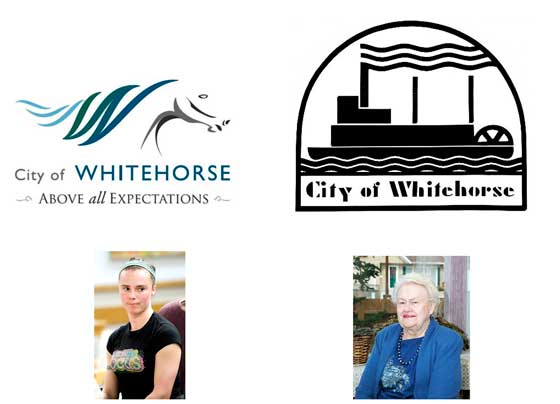
Whitehorse residents continue to be deeply divided over the city's logo after city council announced its intention to retain the sternwheeler logo on Wednesday.
Whitehorse residents continue to be deeply divided over the city's logo after city council announced its intention to retain the sternwheeler logo on Wednesday.
"It's very disappointing,” Rick Karp, president of the Whitehorse Chamber of Commerce, said Thursday. "Lots of people really liked the symbolic horse.”
Karp said the logo could have been used to create a stronger identity for Whitehorse and the Yukon, and would have been ideal for representing northern interests Outside.
"A lot of the time you go down south and when they think of the North, they think Yellowknife. They're always confused,” he said.
The sternwheeler is inadequate, he said, because it doesn't represent Whitehorse.
"I had one person tell me they see that and they think of the Mississippi River, not the Yukon,” he said. "People think Mark Twain.”
The city originally went through an extensive branding exercise and contracted Waterloo, Ont. consultants eSolutions to create the logo for $48,000.
However, after a petition signed by 845 residents asked to keep the sternwheeler, the city opted to make a choice based on a survey.
There were 2,340 responses to the survey. A total of 66 per cent of the respondents favoured using the sternwheeler as the city's logo and 34 per cent chose the proposed stylized horse.
Meanwhile, 55 per cent of respondents chose "The Wilderness City” as the new tagline, 29 per cent selected "Above All Expectations” and 16 per cent favored using "Striving for Excellence”.
Karp said he has heard from members of the business community who feel the whole process was a waste of money, and the least the city could do is work with the logo which came out of the expensive process.
"‘Above All Expectations', that's an interesting slogan. People hear ‘The Wilderness City' and they say, ‘Oh, my God, they're in the bush, there's going to be bugs,'” he said. "They ask, ‘Do you live in igloos? Are your houses on stilts?'”
Gudrun Sparling, a long-time businesswoman whose family has lived in Whitehorse for more than 100 years, thinks the result should be simple.
"This should be very straightforward,” she told the Star Thursday.
"We live in Whitehorse. What could be more clear than using a white horse?”
Sparling said the sternwheelers are no longer relevant, because they are no longer in use. However, she doesn't like the logo created by eSolutions.
"You could hardly tell that it's a horse,” she said. "That particular logo is too modernistic. It wouldn't have a long shelf life.”
Many others in the community, however, are thrilled about the results of the survey.
"On a personal level, I feel really satisfied,” said Vanessa Brault, the resident who started the petition.
"I wasn't trying to fight city council. I was just trying to express something.”
Brault originally voiced her concerns when the stylized horse was near being adopted as the official logo, because she felt many residents didn't even know the process was taking place.
She said the stylized horse logo looked "too corporate” and didn't represent the community.
"From the start, I said if I'm wrong, I have no problem with that. But show me I'm wrong,” she said.
"Now I can show, without a doubt, I wasn't the only person who felt that way,” she said. "I didn't understand why we wouldn't stay with something that represents us so well.”
Local artist Jim Robb also supported the decision, as he feels it helps to commemorate Yukon's rich history.
"Naturally, the steamboat should have been picked,” he said Thursday. "We made a mistake right from the beginning by not doing something more about our historic shipyard.”
He acknowledged that Whitehorse's name came from the rough rapids that used to run by the city, but said that's no longer relevant now that the Whitehorse Rapids Dam has been built.
"That horse meant nothing to Yukoners,” he said. "You've got to ask Yukoners instead of saying, ‘What do people Outside think?'”
Both Brault and Robb believe the branding process should have involved local artists rather than eSolutions.
"Why didn't we spend $1,000 on a competition with local artists? Why are we doing this with a company that isn't even from here?” asked Brault. "This is about so much more than just the look of the logo.”
"Let the kids come up with something,” said Robb. "They probably could have come up with something better than that.”
Either way, the decision is ultimately up to the city council.
"These people are elected to do a job,” said Karp. "They should be strong enough to say what they're doing and do it. If we don't like it, then we don't vote for them next time.”
Sparling said that even though she feels strongly about the subject, she's resigned herself to the end result.
"I'm sure nothing can be done about it. But I think people should stop and think,” she said.
If the sternwheeler does become the official logo, Karp said the business community would live with it.
"We've got to make a decision and move forward. We have way more important things to deal with, like housing,” he said.
"What's the use of attracting people up here if they don't have anywhere to live?” he asked.
See letter,
In order to encourage thoughtful and responsible discussion, website comments will not be visible until a moderator approves them. Please add comments judiciously and refrain from maligning any individual or institution. Read about our user comment and privacy policies.
Your name and email address are required before your comment is posted. Otherwise, your comment will not be posted.
Comments (14)
Up 0 Down 0
Francias Pillman on May 25, 2011 at 10:53 am
All you people who want "change" are addicted to wrecking everything that has made the Yukon a great place. Want change? I hear Toronto is looking for a few good hippies.
Up 0 Down 0
William Campbell on May 24, 2011 at 11:19 am
Whitehorse was named for the White Horse rapids, not a sternwheeler. When I look at the sternwheeler logo, I think of New Orleans, or any other city on the Mississippi River. The argument that the Whitehorse rapids disappeared with the power dam doesn't hold water either, or has anyone seen a sternwheeler operating lately. Speaking as a long time resident, I was hoping for a little change. It would have been nice if a local person had come up with the horse logo, but that design is still better than the outdated and generic sternwheeler we have now. And, did the majority really speak? I'd be surprised.
Up 0 Down 0
Des Deash on May 24, 2011 at 9:42 am
Myrtle and I are planning to take the camper down the old highway again this summer.
We're hoping to visit a few small towns outside. Towns with an attractive logo, of course. We don't much care whether the people are friendly or the weather is nice. We don't give a hoot about their arts and culture or the scenery around the town. It's the branding that draws us folks these days. The symbols that say "This town's not afraid of marketing consultants"
Now, we agree with Mr. Karp, something like a sternwheeler is a bit old fashioned, even for us. Still, I don't think the missus and I would be ready for a Lady Gaga theme either.
How about a logo with a bit of water, a shopping centre symbol and some golden arches? Must be few towns down south willing to spend the few hundred thousand dollars to come up with a brand that will draw the missus and me like a magnet.
Last year we went to Europe. Saw places like Prague, Budapest, Paris, Rome and Vienna. What a disappointment. Half of them didn't even have proper logos. They had crests. I can tell you they had better come up with a better marketing program, find a guy that can say "moving forward" a lot or nobody's going there!
Des
Up 0 Down 0
Joel on May 24, 2011 at 8:10 am
And now we know why they are looking to put paid parking on every street.
Anyone remember what the logo is for almost any other city in the country? What about their tag lines? Does it make you think any different about the city or town if you do remember them?
Up 0 Down 0
Shannon Emslie on May 23, 2011 at 9:40 pm
Fifty grand.....you know what they say....there's one born every day!!!
Council look like suckers on this one.
I'm pretty sure 48 local artists could have been paid $1,000.00 bucks each and come up with something, or at least a fine selection from which to chose a winner via public opinion...or am I mistaken that council is to represent the public!!!
Up 0 Down 0
norm Randall on May 23, 2011 at 2:34 am
I lived in Whitehorse for over 32 years .. 1 st time when the Whitehorse rapids still existed -- maybe at that time the horse might have meant something -- but it does not exist any more -- so use the River boat -- certainly NOT the horrible horse that is being shown in this article -- the River boats did mean something also -- When people look up items about the Yukon they will see items about the River boats == when they come to Whitehorse they will see the Klondike -- and will remember it and tell their friends about it -- and why not get permission from Parks Canada to use a proper picture of the Boat ; they repaired it and should be glad to let the city use the picture to advertise the work they have done to keep the boat in its near original condition --
Up 0 Down 0
Karen Motley on May 21, 2011 at 4:22 pm
$50,000...hmmmm, Mae Baucher or the Food Bank could have used that money, if the City had it to spare. Whitehorse has a thriving arts community who most of which are long time Yukoners. They might just be qualified to enter a tender process for a new logo.
Up 0 Down 0
B Burkhardt on May 21, 2011 at 2:01 pm
Without the sternwheeler there would be no Whitehorse. Transportation was always the basic of the city. Forget the Mark Twain blabla. Sternwheeler and Whitehorse are one. My suggestion is to ask local artist to bring together the sternwheeler and the "White Horse" Rapids. Have the sternweeler modified, but keep them. A word to the horse logo. It looks nice but the horse could be everywhere on the globe.
Up 0 Down 0
M Blahitka on May 21, 2011 at 4:24 am
Well done Vanessa! I also fully agree with Jim Robb - we should be doing more to preserve the rich history of the Yukon and also support our very talented local artists!
Up 0 Down 0
Scott W. on May 20, 2011 at 8:38 pm
I prefer the horse myself as a resident however there is no reason why the price-tag came in at close to $50,000!
That logo I could make using free software for a whopping $.25 email.
I am also disappointed that this was not open to local artists who have amazing talents. Why the need to outsource when it should come from a local.
Up 0 Down 0
M. Peltier on May 20, 2011 at 10:58 am
Mr. Karp, if you like the 'new' logo so much then why don't you just adopt it for your Chamber of Commerce.
Up 0 Down 0
Kat Secord on May 20, 2011 at 10:11 am
I'm not sure where the process goes from here, but I do agree with the point that looking for new options could come from within the Yukon. There are a variety of design artists, design companies, and communication specialists within the territory. Who better to bring out the local flavour? Let the creative juices of Yukoners flow.
Up 0 Down 0
Dan Davidson on May 20, 2011 at 9:50 am
The people have spoken, Rick. Quit carping.
Up 0 Down 0
Steve E on May 20, 2011 at 9:36 am
Democracy has spoken and it is refreshing.